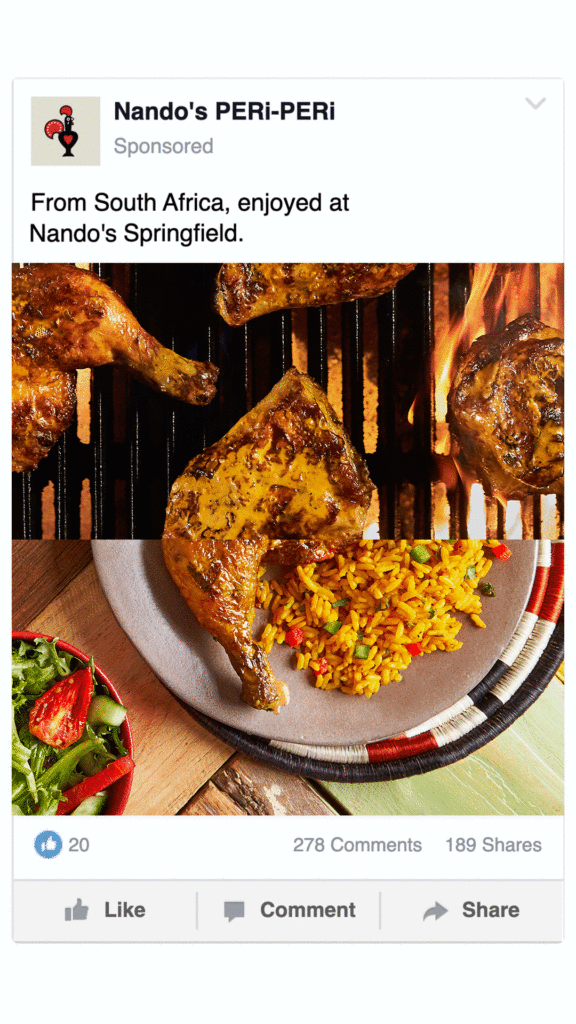
An omni-channel campaign leaving you hungry for more
I led the creative direction for an omni-channel campaign built on a very intentional stance: we know you don’t know. we didn’t try to fix that. Because the moment you over-explain Nando’s, you flatten it. The brand works when it feels a little discovered, a little inside-jokey, like you’re in on something others haven’t figured out yet.
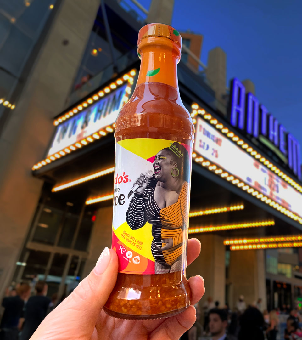
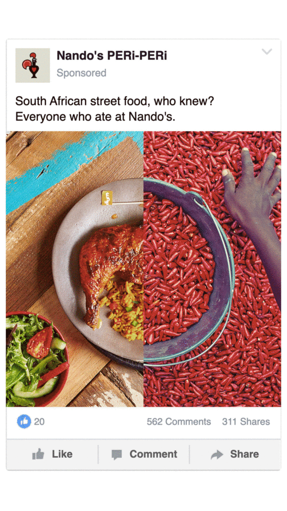
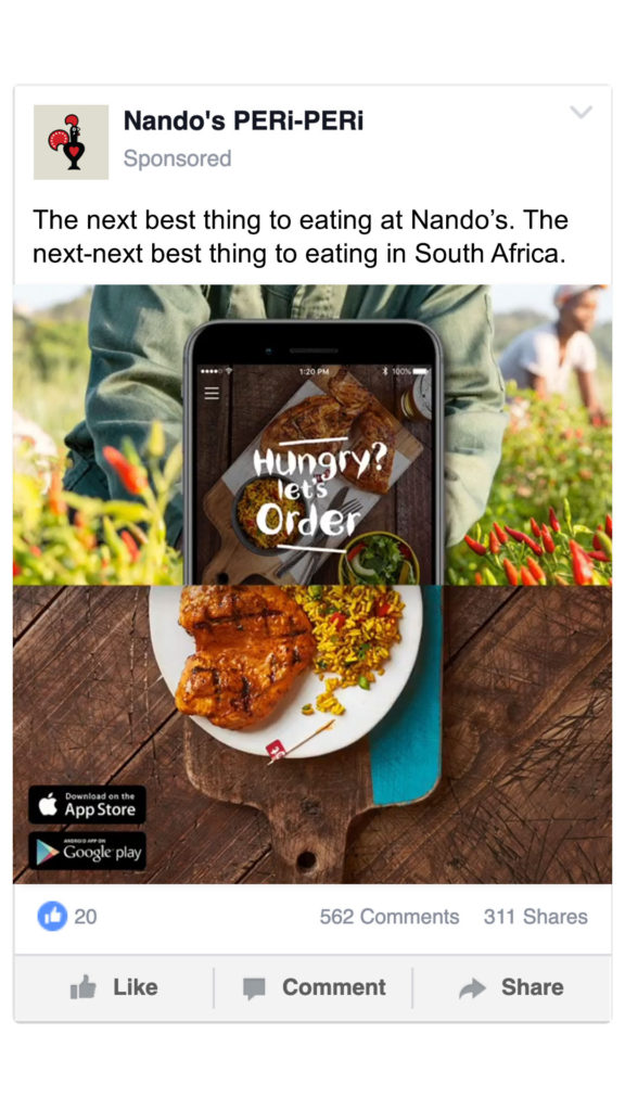
That idea drove both the tone and the system. We built a 50/50 visual structure that played with what you know and what you don’t. Familiar on one side. Unfamiliar on the other. The tension was the point. It showed up across social, OOH, in-store, and direct mail so the brand didn’t just say something once, it repeated a pattern people could start to recognize.
The voice did the same thing. Instead of educating, we leaned into the gap. “South African street food, who knew?” “Let’s have South African…said no one ever.” Slightly provocative. A little self-aware. Confident enough not to over-explain.
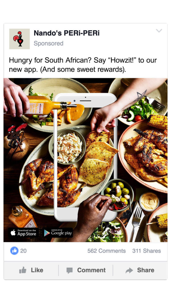
And then there were the moments where that stance actually had to hold. In a photoshoot, the default direction was a neutral wood background. Safe. Familiar. The kind of look that works for Sweetgreen or CAVA. It also would have made Nando’s look like everyone else. So we pushed for something else. Bright, high-contrast color pulled from South African design. Greens and yellows that felt specific to the brand and made the food stand out more. Not just aesthetic. Strategic. Because once you start making things more “comfortable,” you’re already losing what makes them distinct.
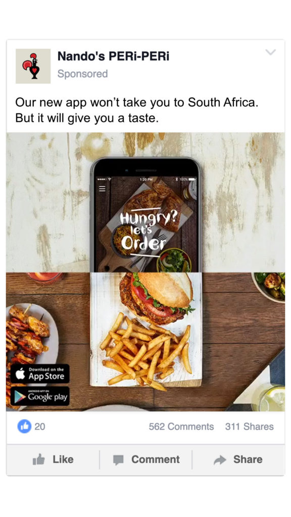
We made that call repeatedly. No over-explaining. No softening the voice. No rushing to make it make sense. Because the goal wasn’t immediate understanding. It was intrigue, followed by recognition.
The result was a brand that didn’t just enter the market, but held onto what made it different. Nando’s saw rapid expansion, increased traffic and sales, and strong retail performance of its sauces. But more importantly, it built early cultural traction. Not just “what is this?” but “oh—I get it.”