Paving the way to a distinct brand experience
I led the translation of what “distinctly CarMax” actually means from a brand strategy into experience design, because before this, it mostly lived on a slide. The core realization was this: confidence gets people to trust you. Excitement gets them to move. You need both. That shifted how we designed. We stopped adding more information and started removing hesitation. Clearer next steps. Fewer competing actions. More visible progress. Letting people edit things like location or filters without losing their place. Small things, but they’re what make someone feel in control instead of stuck.
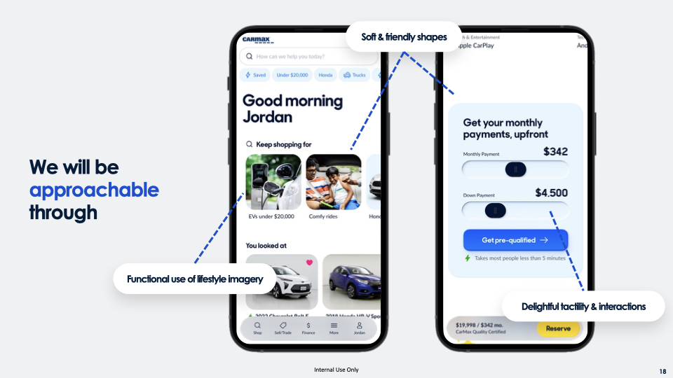
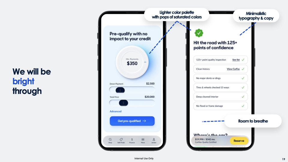
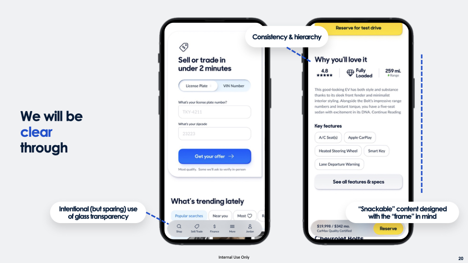
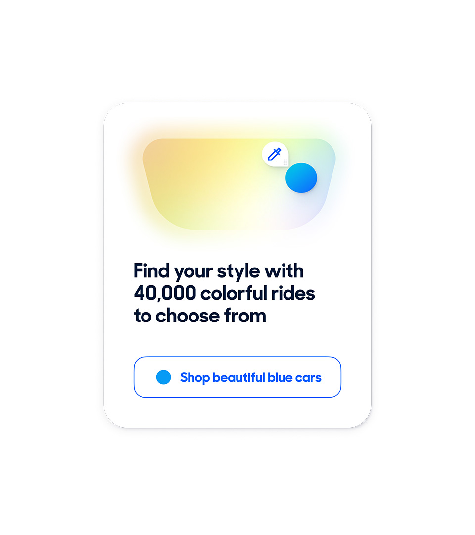
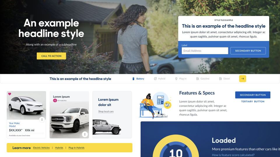
That showed up in very real, opinionated choices. We treated color as a tool, not decoration—creating moments of energy at the right time, not noise everywhere. We cut visual clutter so people could move faster and feel more in control. We used brightness and white space to make decisions feel easier, then layered in excitement where it actually helps—when someone is discovering, narrowing, or ready to act. Because excitement without clarity feels like pressure, and clarity without excitement feels flat.
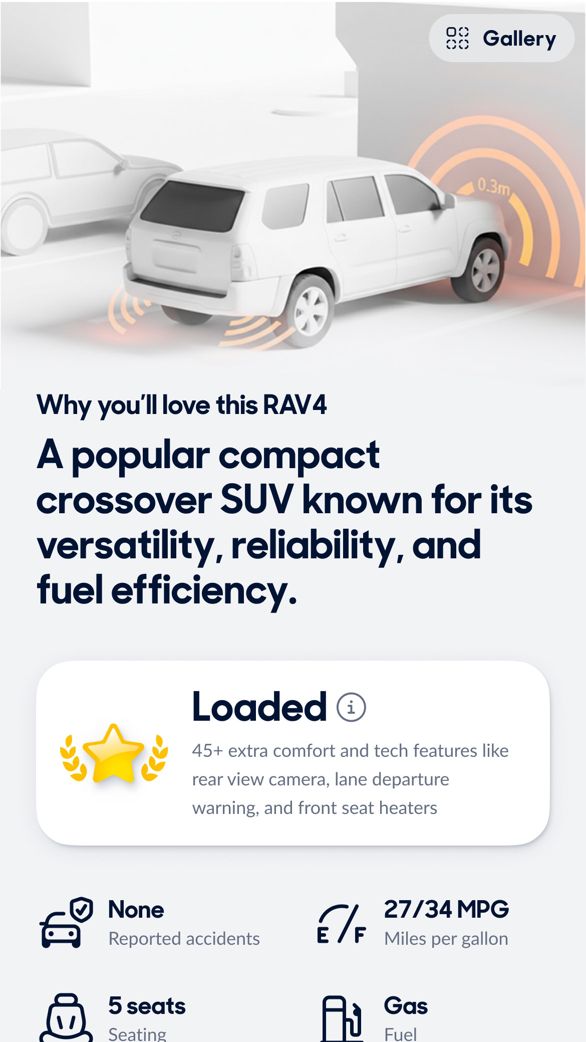
From there, I drove a system, not just a refresh. A scalable design language across UI, interaction patterns, emails, and store associate tools. We applied it to high-impact moments like the homepage (first impression and discovery) and product page (decision-making moment). Just as important, I made it stick through cross-functional checkpoints, early review loops, and a network of ambassadors that scaled the system across teams so it wouldn’t quietly die after launch.
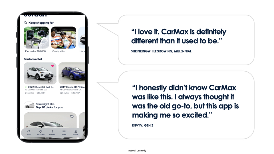
The result is a product experience that feels intentional again. Not just more confident, but more alive. We saw increases in engagement and customer satisfaction, along with a stronger perception of both trust and excitement, especially with Gen Z. Users consistently described the experience as “easier” and “more engaging.” More importantly, it changed how decisions get made. Less “what do we like?” and more “does this build trust and give people a reason to move?”
This work has since been featured in Kotler’s Principles of Marketing—one of the best-selling marketing textbooks in the US—as a case study in how brand shows up in modern omni-channel product experiences.

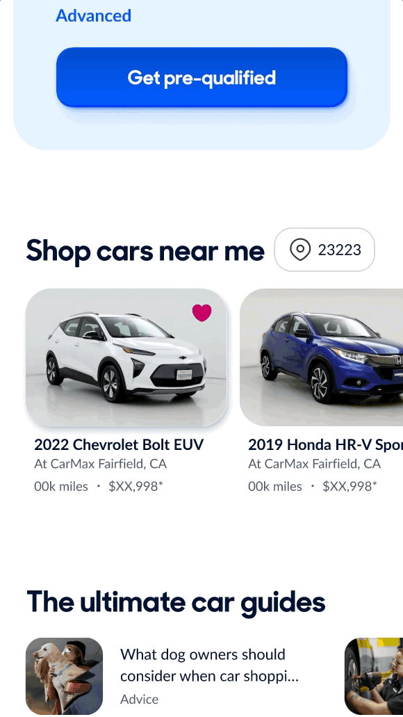
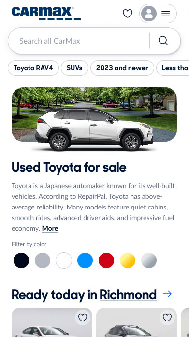
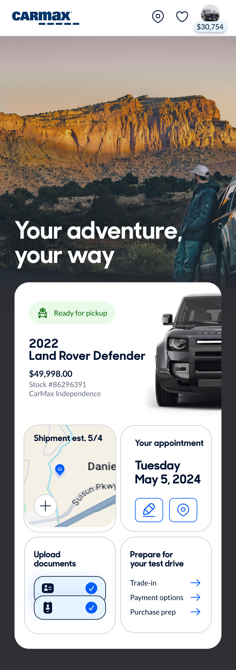
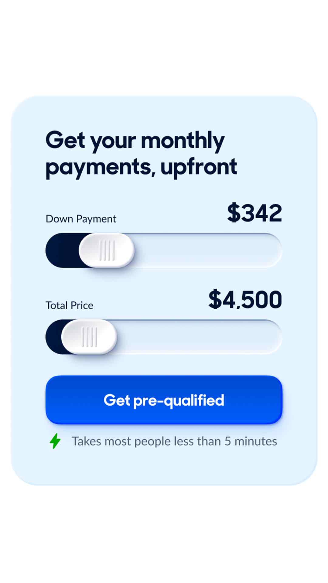
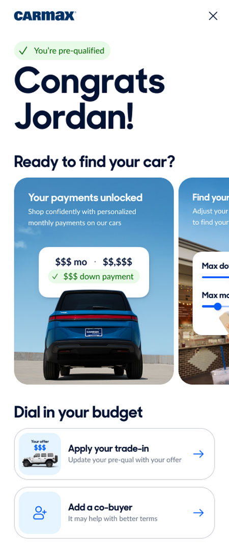
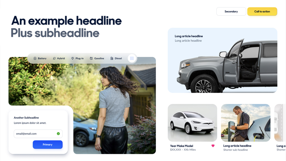
Before
After